Wednesday 25 March 2015

Colin Lloyd Edition workshop.

Following the previous printmaking workshop with Colin we had spoken about wanting to build on what we had learnt by creating a book with our groups prints in as editions.
Depending on the amount of people thinking of doing the project it depends on the name we are hoping for 10 x 10. The theme of the prints will be still life which is open to our own interpretation. We are not limited to any one type of printmaking method and are being encouraged to experiment with different processes such as silk screen, dry point, etching, and many more. I am looking forward to do this project as I am learning the skill of reproducing a print and aiming for a finished book at the end of it.
 
Our deadline is Tuesday 5th May. For the book we aim to make a wrap around cover, with torn edges, each sheet will be 250x350. With a 20mml margin there should be 14 sheets of paper.
 
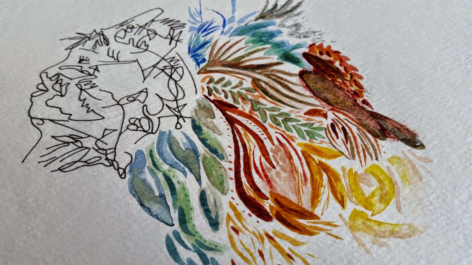
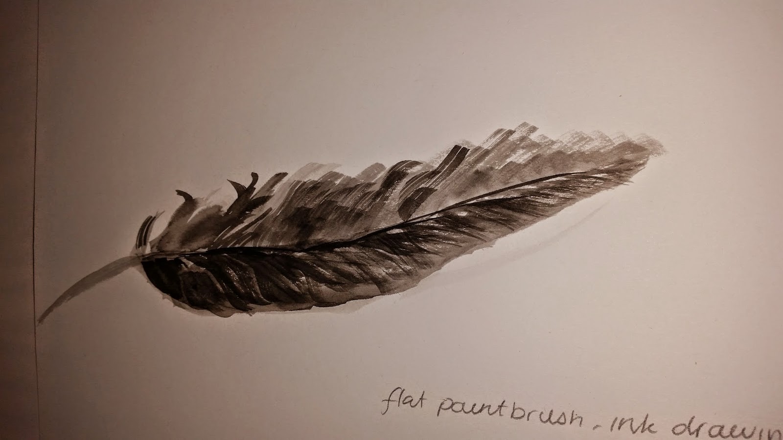
After having a tutorial with Colin on my ideas I have for the print. I have a lot of artist research and experimentation to do over Easter break ready for trying once arriving back at university. I showed Colin my watercolour and dry point pieces as I wanted to do something similar for the prints but the portrait wouldn't be considered still life. So over Easter I plan to use my grand parents old china dolls to draw their profiles which will then fit with the theme. Once back from the break experimenting with processes such as embossing, paper cuttings, masking tape, and mono prints.

Dry point from collected objects.

I started doing some dry point drawings on metal plates from some of the objects I collected. Previously I have only glued objects to a metal plate to print so drawing into the plate was something I haven't tried before. Once the drawing was finished I could start applying the ink and using skim to remove the excess. with the plate inked and ready for me to start using I soaked some paper then dried it using the blotters. The first couple of prints came through but only faintly so I thought of adding more ink the next time and pressure. The prints still didn't come out as clear as I wanted to due to the paper the second time being too damp. Today I ran out of time to correct this but I plan to try this again and maybe crop the plate down so I don't print so much of the general marks on the plate.


Saturday 21 March 2015

Screen Printing.

Today I have been starting to create some work from the objects I collected from Formby. So I started choosing some objects that I found most interesting in structure and shapes that I could expose onto a screen. However some of the objects were either too sharp or could not be flattened so I am planning to try scanning them and putting the images on another screen. Once coated the screen it needed to dry I then exposed the objects, washed the screen then waited again for it to dry. Once dry I could start printing, I was really happy with how well the objects had exposed onto the screen. I started by choosing the sections I found most interesting for my first prints by taping them off I could print them separately. These worked well and I then started to try printing the whole image. I changed from using a deep green to a golden brown sandy colour inspired by the colour of the seaweed i had collected. The colour worked really well I loved the prints for the mixture of block, bold shapes of the leaves and the fine, delicate lines of the string.


Development from Painting workshop.

The next stage of the work shop Stevie told us to try in our time was building onto the paintings we had done earlier. To do this we scanned the paintings we created to music and portraits. Once scanned and printed we ripped them into small sections and passed them round choosing the ones that we found the marks, colours most intriguing. 

We then stuck each section on a page in our sketchbooks the aim now was to create small collages using the section we chose as the starting point. I would place a section on my page and then start trying to recreate and work from that central point to experiment making the same marks, colours and shapes.

It was fun as we were again changing something that we all worked on to make something new it gave you a sense of freedom with the pieces. It was also a challenge to try and make the same marks and mix the colours. Making you think more about what your doing or have to do to create one colour or brush stroke.


Further experimentation.

I have started to experiment on my other dry point prints using a range of media. For the first image I used brush dyes and watercolour paints I really like the translucent effect you get with these materials. Another effect I could achieve with this medium was by adding a lot of water to the ink or paint I was applying it would run on the page. I was happy with this as it reflected the similar effect Carne Griffiths creates in her own work. 


The second piece is simply a coloured pencil drawing onto one of my faded prints I liked the mix of the fragility of the lines from the print and the bold tonal areas I created by blending the colours.

University of Salford Swap shop event.

Earlier in the week I took part in a swap shop charity event I was told about it through my friend. The event was run by four Events Management students with the aim of raising money for Manchester Mind, the local mental health charity.
 
I helped with the event by donating two paintings to be sold at the event. Although they did not ell it was still fun being involved and I'm looking forward to the next opportunity like this.


Wednesday 18 March 2015

Development of dry point prints.

Starting to work back into my dry point prints was inspired by the colour schemes that I had noted Carne Griffiths and many other artists that took inspiration from nature used. I created shapes and patterns flowing from my print that I created from looking at the objects I collected from Formby and artists work. I'm really pleased with the pieces and if I get time will try copying them onto another dry point plate to be printed again. As I want to keep changing and building on my own work using many different processes.

Detail.

Dry point print, collaged with watercolour painting, ink, and coffee.

Fine liner pen drawing, and watercolour study.

Detail.

5 minute watercolour study.


Primary research- expeimental drawing.

Here are my experimental drawings I conducted from looking at the objects I collected whilst at Formby beach. The aim of this was to achieve many different marks, shapes and patterns in unconventional ways. I was happy most of all with the results of the toothpick and ink drawings as I liked the delicate, curved lines I could make.


drawings from pine cone using range of tools to apply ink.

I used an art straw and ink for this drawing.

I used a toothpick for this drawing.


Again I used an art straw with ink.

Blind pencil drawing of an oak leaf.

I used a flat paintbrush with ink to do this drawing of a feather.
Tonal water colour painting.

Detailed watercolour painting.

Collecting from Formby.

Here I have started to photograph some the objects I collected from Formby beach and woods. I really was surprised by the range of debris on the beach shore line. The shapes and structural forms are what attracted me to the objects and I hope to start drawing and using them in my work soon.


These are only a few of the many objects I have collected I plan to start drawing, painting, printing; dry point, lino, screen printing and more processes.


Monday 16 March 2015

Dry point!

Here I have mixed elements of Carne Griffiths and my own work to achieve this abstract profile. I like how there seems to be a mixture of free flowing lines with more angular marks. Using watercolours, ink and coloured pencils I plan to work back into these prints.


Dry point continued...

This time I used one of my own watercolour paintings to take inspiration from. I really like this print for the different weight the lines have. I would like to try this again but maybe trying a lino print so that I can use colours for the negative space between the feathers.

Here the printing bed needed more pressure to get a clearer print.


My own watercolour painting which inspired me for my print.